Cyber Purple
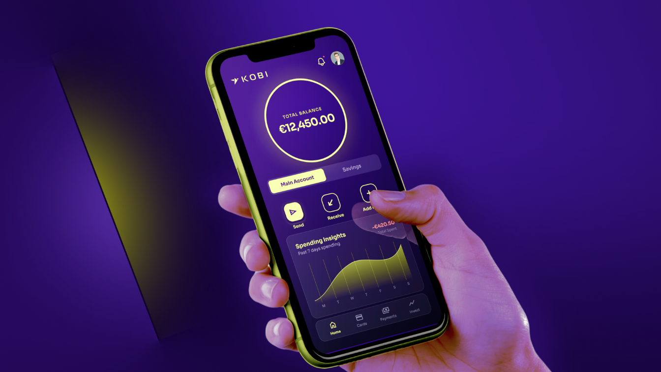
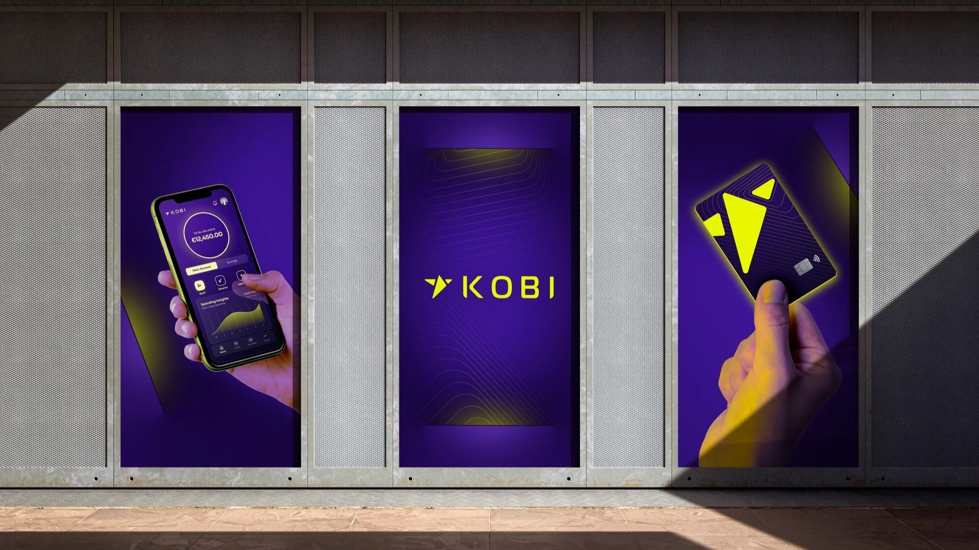
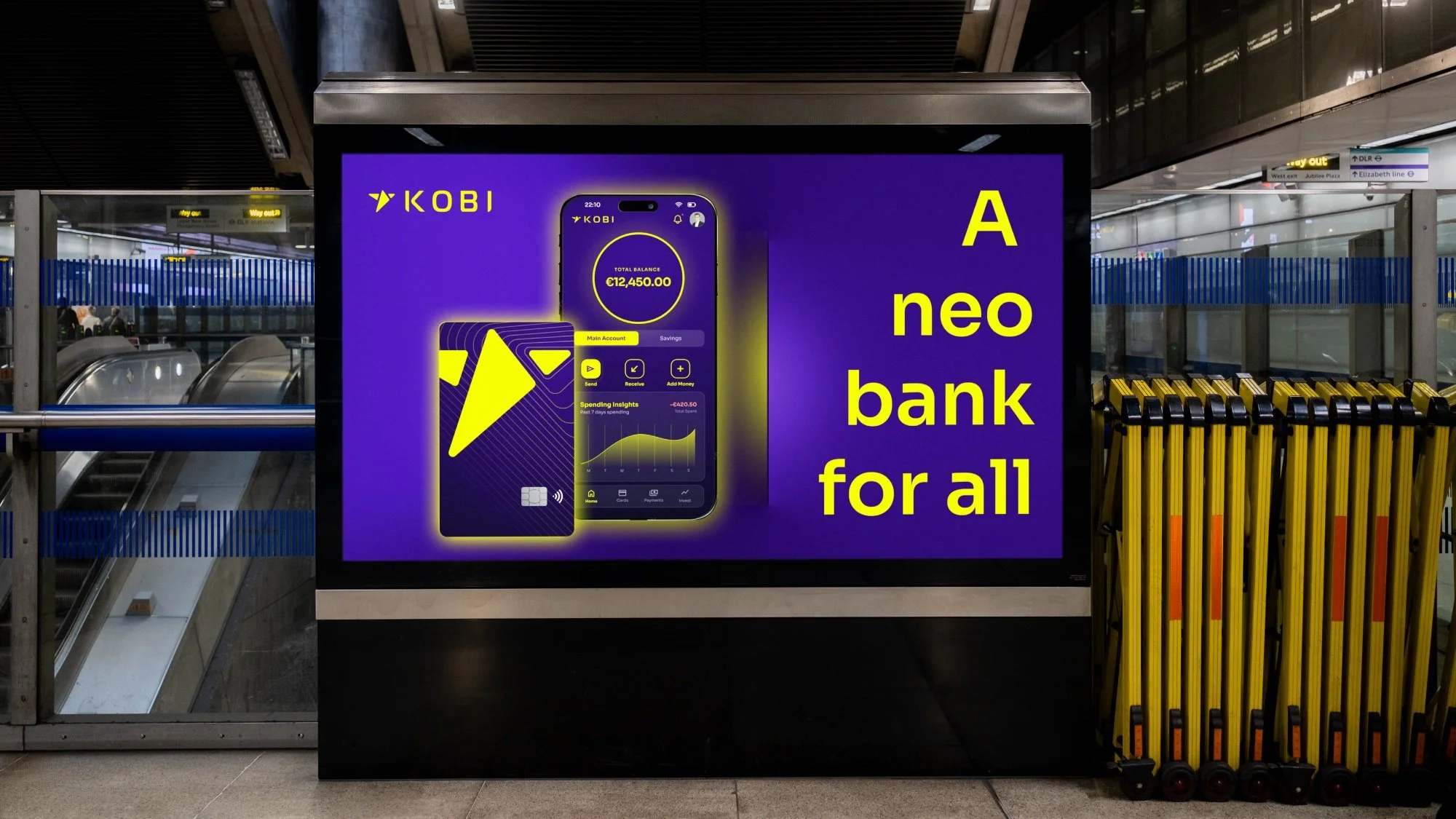
KOBI is an imagined neo bank based in Europe, with its target audience placed all around the world. It provides banking services without the hassle and complications of classic banking. The target audience is younger generations of any background who wish to access their funds and opportunities using just a few taps on their phone. The brand is retro-futuristic, combining the security of old-fashioned banking with the flexibility and modernity of cash apps.
Inspo
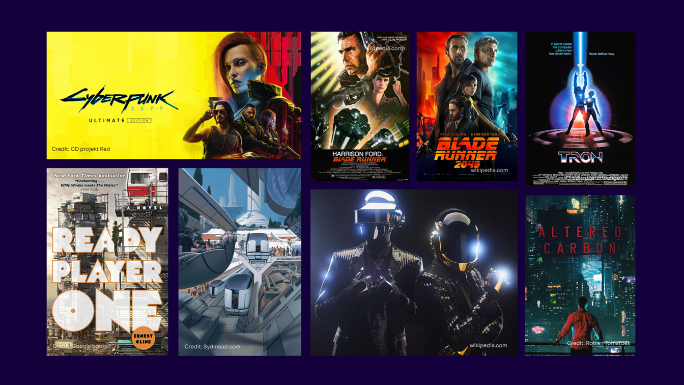
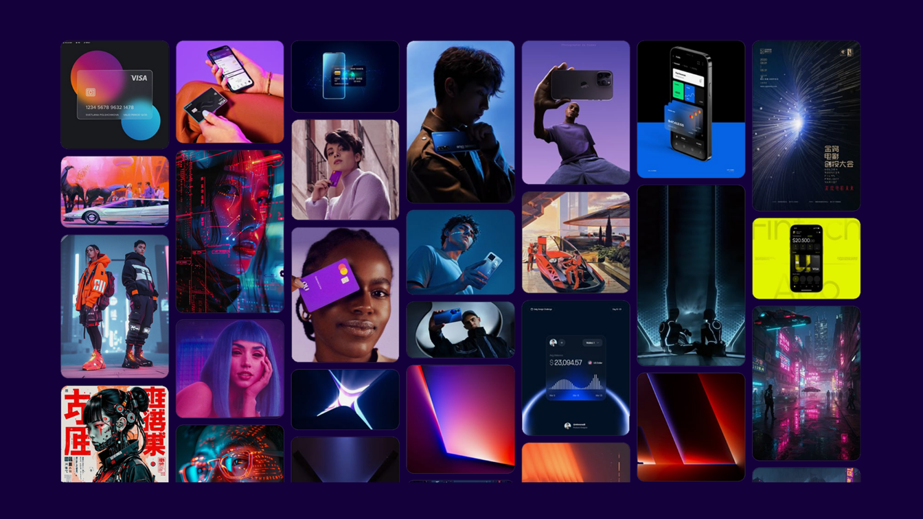
Inspiration comes from the world of Cyberpunk, which I am always drawn to. The retro-futuristic style reminds me of old school banking security combined with the modernity and flexibility of banking apps. The product moodboard is vibrant and full of energy. Gradients, flexibility and lifestyles are the main themes here, focusing on the needs and desires of the younger generations and how they want to be in charge of their funds.
Branding & Colours
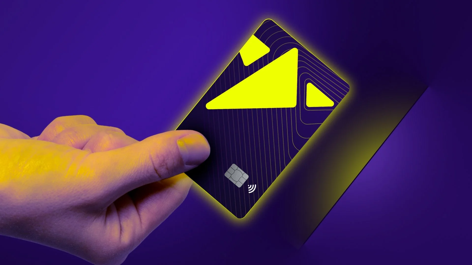
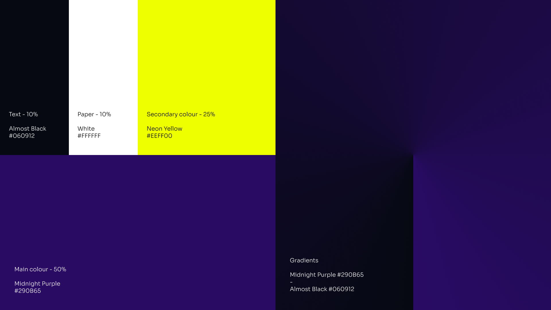
Because the target audience are younger people, teenagers, young professionals, students, for many of whom, this would be their first opened bank account. The idea is to offer “financial freedom”, “opportunity”, “escapism”, “financial independence”. An app and bank card that will be there with you on your adventures. The concept is Cyberpunk themed, therefore the palette is a mix of bright neon yellow and purple mixed in with dark accents
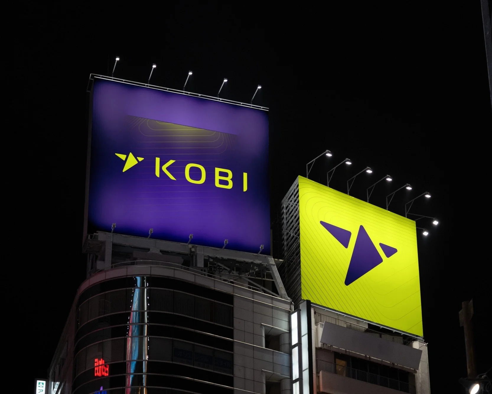
Logo
The logo is a simplified silhouette of a colibri bird. This is the symbol that stands for the brand, the name and the philosophy of the company. Just like the claim, hummingbirds symbolise growth, opportunity, and new beginnings. Linked to nature’s fresh energy, they encourage personal evolution and emotional restoration.

Graphics
Main visual theme and campaign set around “lifting edges”, “funds glow”, and the line pattern generated from the shapes of the logo. The combination of these are meant to represent opportunity and modernity.